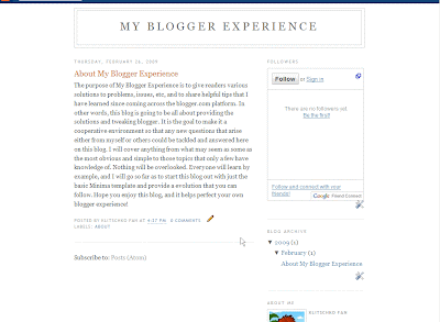
As you can see pretty basic. The only post I've done so far is just what this blog is going to be about. Now how do you go about adding a post? OK on top you see the following options.

Your going to want to click on "Posting" on the left hand side. This will take you to this screen:
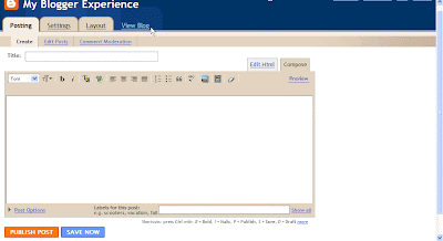
OK. so far so good. Now one of the most important parts of the post is the "Title". It's up top and looks like this:
 This is where you add the title of your post. It's important because not only will it give the reader an idea of what's going to follow it, but it also counts as the name of the web page which can be found by search engine spiders. In this post I will name it "How To Post". Appropriate enough.
The screen below this is the window where all the actual content will be added and modified:
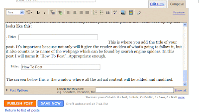 Right now as you can see the compose tab is selected as opposed to the "Edit Html". For right now we'll just worry about "Compose" because it's alot easier to start posting immediately. All you have to do to start typing. Is just click your cursor into the big open window there where it shows text in the picture above and start typing. Very easy. If you want space press enter a few times.
And there you go more space. If you want to modify anything it can all be done with the section immediately above the posting area which looks like this.

On the very left you see a drop down menu that say Font. This is where you can change fonts. Most of the time it's not anything you need to worry about but if you want to make things look the way you want them as far as text this is the place to go. Here's Verdona text font.
Here's Webdings text font. Here's the normal default text. Yeah!
Immediately going to the right we have a big T symbol. This is for text size. It's on normal now but goes from smallest to largest.
Next we have the b symbol-- you click this if you want to bold text.
To the right of that we have the i symbol. This is if you want to italicize text. You can even bold and italicize at the same time by clicking both.
To the right of the b and i symbols we have another T symbol but this time on top of color palette. You can probably guess what this if for. Changing colors. Default is black, which is what you will use most often.

Immediately to the right of the T symbol with colors there is a funny looking green button. This is used to make hyperlinks to link to other pages/sites. To use it create the text you want to use as anchor text. That's just means the text people will see that allows you to click on. So let's do it to link the the About page for example.
Select the text:

Then click the funny green button:
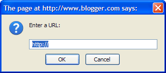
To get the URL of the about page which was my 1st post, I just clicked on the Title of the previous post and copied the URL.
Then I just pasted the URL into the box.
OK. So far so good. To the right of the linking option we have 4 buttons in a row that look kind of similar. This if just to indicate how you want to layout the text.
This is 1st button of the 4 which is align left.
This is the 2nd button of the 4 which centers.
This is the 3rd button of the 4 which is right align.
Actually if you start messing with too many of the options at one time the WYSIWYG(What you see is what you get) editor starts acting funny. I'm mentioning this because I can't show you the 4th button now,which is justify full. lol
To the right we have a symbol for numbers.. This allows you to make a numbered list.
To the right of this is a similar option but this one just does bullets.
OK to the right of the blockquote button is a symbol with ABC and a check mark. This is spellcheck. You click this and it will highlight which words the editor feels may have been misspelled in yellow. By clicking the yellow highlighted words it will give you options to what spelling you may have intended.
OK to the right of spellcheck is a Picture symbol. This is for adding pictures like you see on this post. When you click it this window comes up
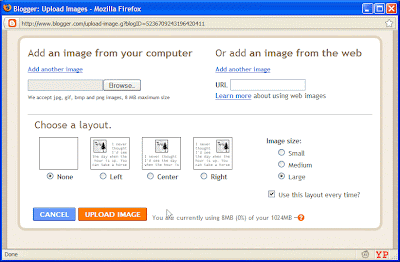
and most of the time you will just click the browse button and choose a picture off your hard drive that you want to display. For now just choose "none" for the layout option if it isn't already selected and click upload image and click done.
The last 2 options I never use so don't worry about them.
To the very right you see preview. By clicking this you can test what your page would look like if you actually clicked the Publish Post option.
OK so we're almost done. Below the post you see a section that says "Labels for this post: e.g. scooters, vacation fall" This is where you insert a comma separated label for the post your created. It's convenient because not only does it allow you to keep organized, but you can insert later a widget that will show all your labels and the number of post that have those labels. This is good for people looking at your blog who want to find information on a certain topic. For this post I have decided to use the labels "Formatting" and "Posting".
That's it click Publish Post, or Save Now if you want to come back and work on your post later.
**Note I have also added Technorati tags. I will talk about this another time.
- Just click on it
- and every time
- you hit enter
- it creates the
- next item in the list
- easy
- just click it again when
To the right of this is a similar option but this one just does bullets.
- 1st item
- 2nd
- 3rd
Got text you want to make look different and blocked in from the rest. Just select the text you want to change and click the quotation mark button to the right of the bullet list option. and text will look like this paragraph. Click again to turn off.
OK to the right of the blockquote button is a symbol with ABC and a check mark. This is spellcheck. You click this and it will highlight which words the editor feels may have been misspelled in yellow. By clicking the yellow highlighted words it will give you options to what spelling you may have intended.
OK to the right of spellcheck is a Picture symbol. This is for adding pictures like you see on this post. When you click it this window comes up

and most of the time you will just click the browse button and choose a picture off your hard drive that you want to display. For now just choose "none" for the layout option if it isn't already selected and click upload image and click done.
The last 2 options I never use so don't worry about them.
To the very right you see preview. By clicking this you can test what your page would look like if you actually clicked the Publish Post option.
OK so we're almost done. Below the post you see a section that says "Labels for this post: e.g. scooters, vacation fall" This is where you insert a comma separated label for the post your created. It's convenient because not only does it allow you to keep organized, but you can insert later a widget that will show all your labels and the number of post that have those labels. This is good for people looking at your blog who want to find information on a certain topic. For this post I have decided to use the labels "Formatting" and "Posting".
That's it click Publish Post, or Save Now if you want to come back and work on your post later.
**Note I have also added Technorati tags. I will talk about this another time.
Technorati Tags:


No comments:
Post a Comment